12 great intranet navigation examples
For years, “I can’t find what I’m looking for” has been the most common feedback when end-users are asked about their intranets. And no wonder since there are plenty of examples where solutions for search and navigation have proved to be below-par tools for mastering a growing mass of content within the digital workplace. But it doesn’t have to be that way! In this article we will provide twelve navigation examples to show how modern intranet products can help you surpass this type of challenge and provide an improved user experience.
The ‘Intranet and Employee Experience Platforms‘ report provides reviews on 20 leading intranet products and states that user experience is consistently strong and that Omnia is a product that stands out in this regard. The product gets praise for delivering a fully-featured intranet with impressive performance and strong search, navigation, and targeting capabilities, all important aspects of a successful intranet.
But before we jump into the examples, it is worth pointing out that navigation challenges can’t be discussed and solved without an understanding of user needs and patterns, content types and attributes, labeling, common devices, and similar aspects. We won’t cover how to prepare navigation solutions in this article but instead focus on the examples.
Let’s now look at the twelve chosen screenshots – all based on Omnia and Microsoft 365 – starting with one of the most common navigation components.
Mega menu
Mega menus are great for providing an overview of content within a section of the intranet. In the first example below, we see a basic navigation layout with content on two levels. But we have also added an introduction to this section of the solution on the left. In this way, it is possible to provide an introduction and set expectations on what type of content can be discovered here.
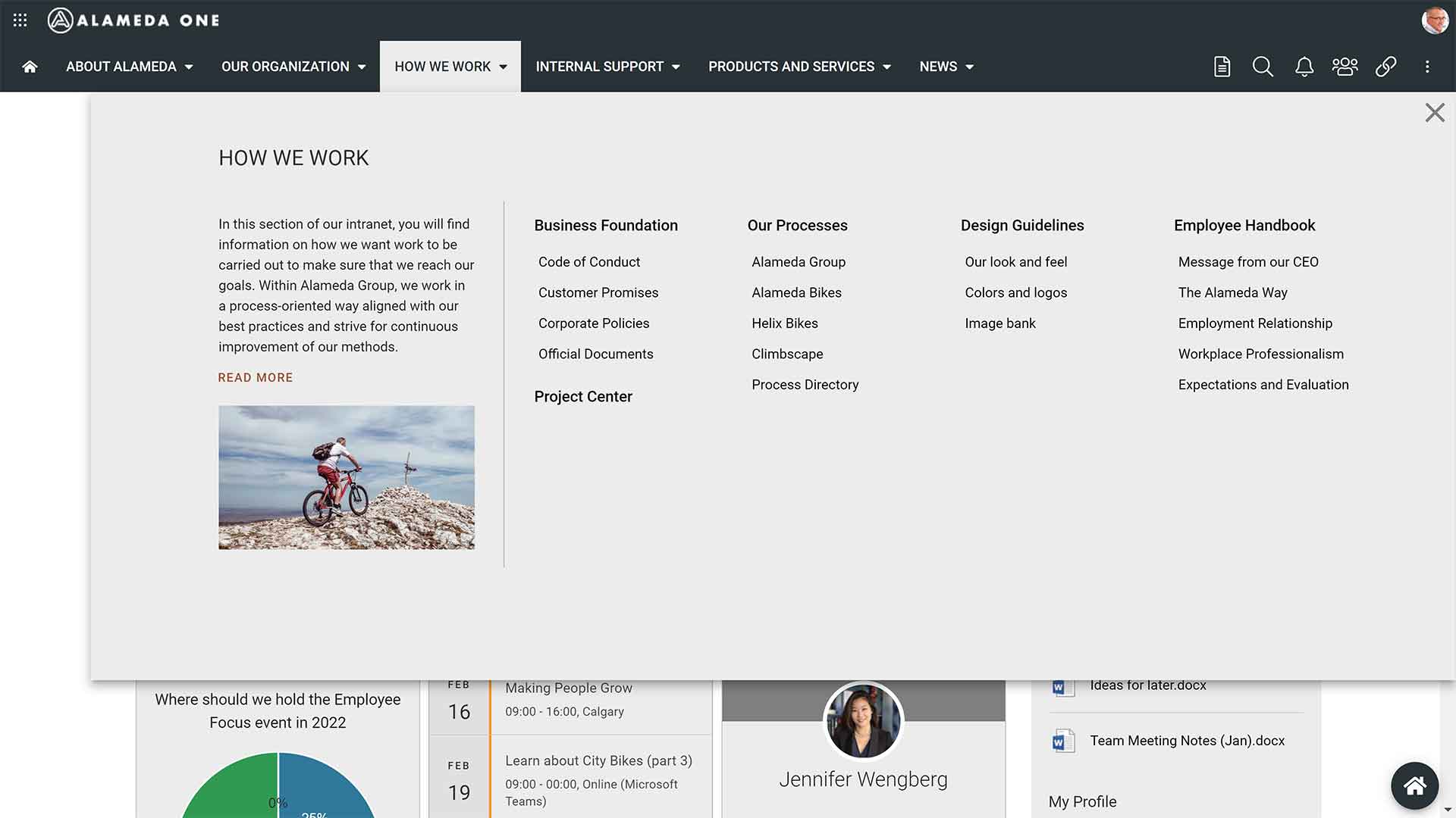
Image 1: Classic mega menu with two levels
The example above is showing two levels of pages, but the number of levels is a setting that can be configured to show further levels as shown in the next screenshot.
In this example, the mega menu covers three levels of pages, and here we have also included a type of ‘landing page’. When opening the menu, the end-user will first meet with a list of selected content like followed pages, popular pages, or as in this case, the last updated pages. In this example, the first level of the navigation is presented to the left, and when a node is selected the next two levels will be shown.
Image 2: Classic mega menu with three levels
But the mega menu can also be designed to be somewhat more innovative and support the overall ‘look n feel’ that many organizations want their intranet to mediate. In the next example, we have selected a background image that is distinctive for the organization and placed the sub-sections in a card view with a header image and an initial summary. The cards represent the second level of pages, and the links within each card show the third level.
We think that this is a great example of how mega menus can be designed in an appealing way, supporting both employer branding and the overall user experience.
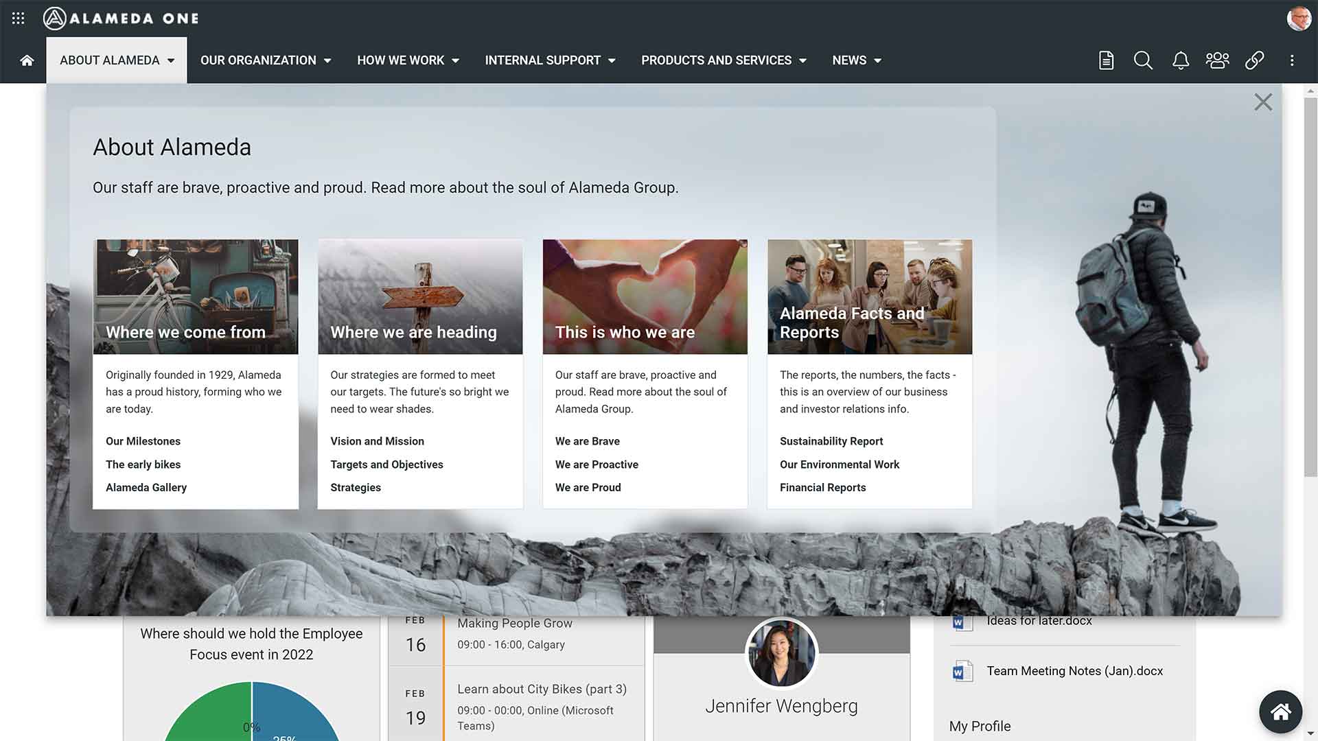
Image 3: Card-based mega menu in two levels
Another way to provide user-friendly navigation can be to allow visual navigation within the mega menu. In the example below we have included the possibility to navigate organizational charts before selecting ‘Show more’ to visit a department page. This shows how a mega menu can be truly dynamic, providing a visual presentation of hierarchical structures that also could be used to show offices per country or a product catalog with groups, products, and variations.
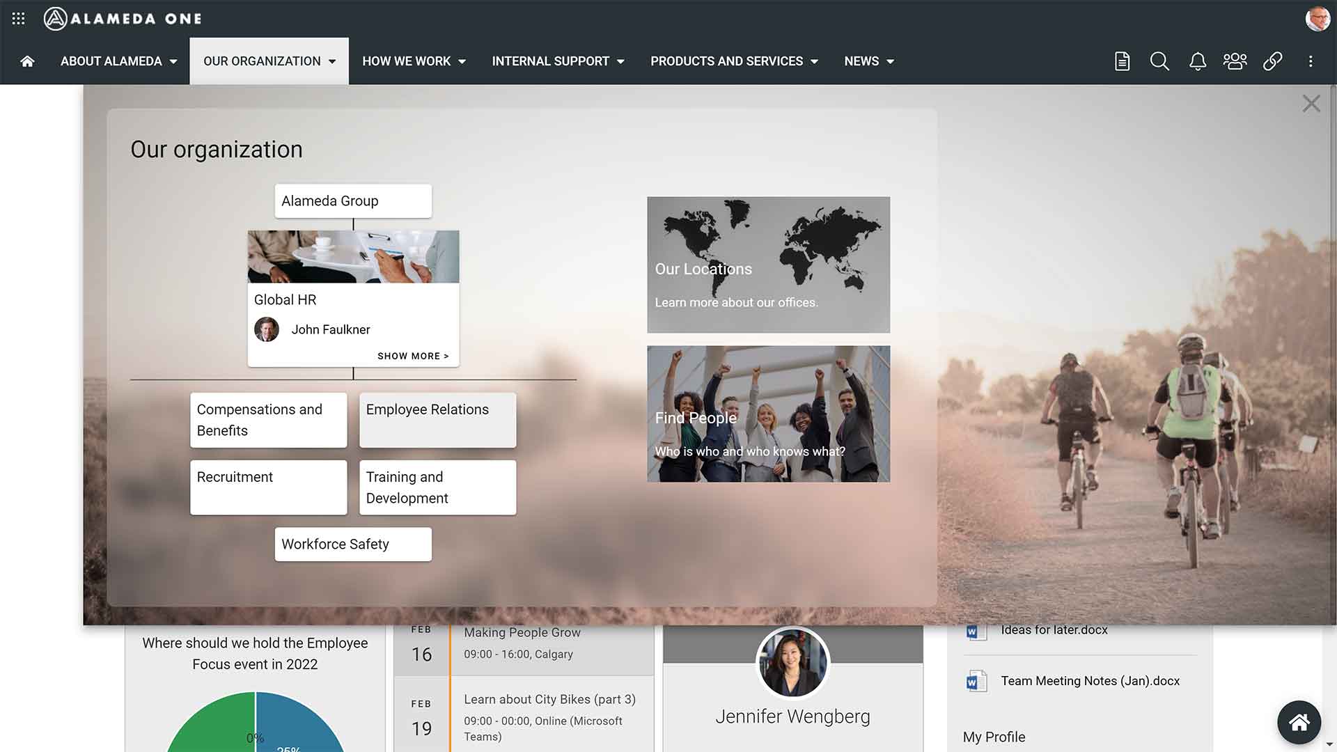
Image 4: Dynamic mega menu with organization charts
Landing pages
Landing pages can be a helpful supplement to the mega menu, providing information on and navigation within a sub-section of the intranet. Our experience is that landing pages not only should provide innovative navigation solutions but also be used to implement a corporate profile. An example is this landing page showing all offices within a business with a suitable background image.
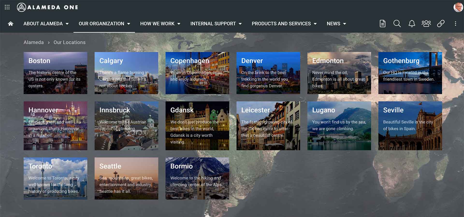
Image 5: Offices landing page
Another example is this landing page with navigational blocks and tabs to help present content in a Learning Center in a structured way. The tabs will add another dimension when it comes to navigation and this example can be described as a three-in-one landing page.
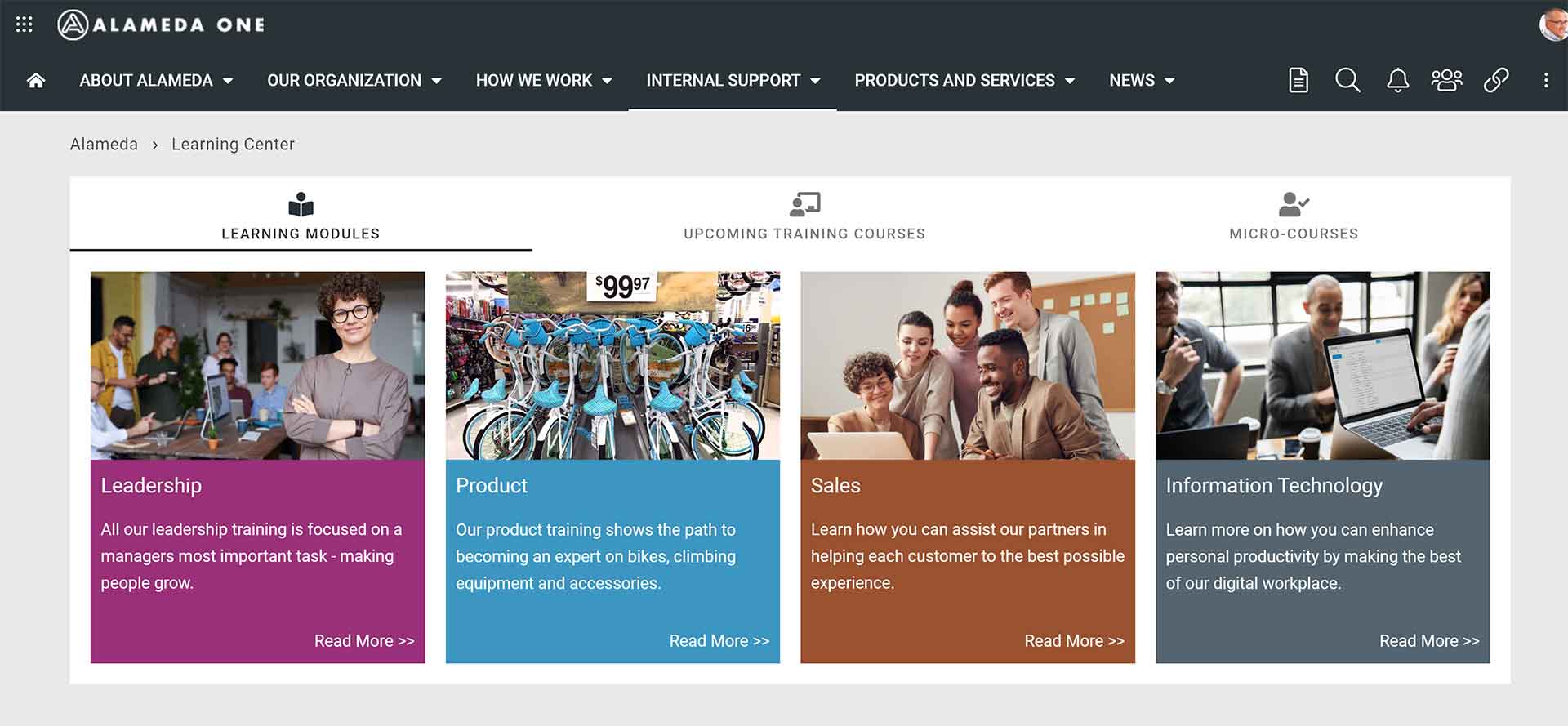
Image 6: Learning Center landing page with navigation blocks and tabs
In the above example, end-users can navigate to courses within four areas and sign up for any course that matches their needs and interests. But also check the course calendar in the second tab and a gallery of micro-courses in the third one.
Current navigation
On web pages within a section, you need to provide current page navigation which in most cases is provided to the left on the page. In the example below, we can see the second level of the mega menu and also a third and fourth level of pages. The page Time Management is in this case a page on level three and it has two sub-pages on level four.
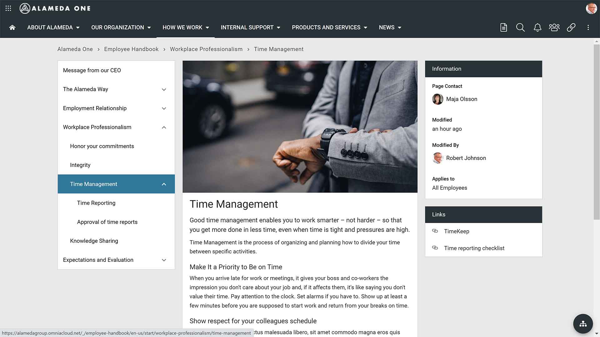
Image 7: Current navigation
In the example, an end-user can also follow the breadcrumb to learn more about the page context. The page sits within the sub-section Workplace Professionalism within the Employee Handbook.
But the top node ‘How we work’ is not included in the breadcrumb, which shows another important learning on navigation – that there can be a difference between how you organize where information is created and managed and how the navigation structure is built up. This can be used to achieve a setup that is efficient for content owners and authors and navigation that is optimized for findability.
Directory navigation
Directories can be a good solution when building navigation for objects where there are no real hierarchies. The directory would then typically list the objects in an order of your choice and provide search and filtering features for making it easy for end-users to find what they are looking for. Common examples of when directory navigation is a suitable choice are for news article archive, a directory of official processes, or as in the image below, a project portfolio.
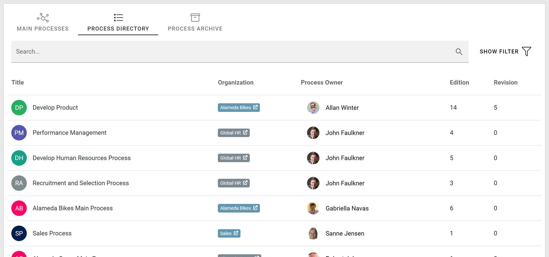
Image 8: Directory navigation of a project portfolio
In the example, end-users can find all internal projects running within the organization and they can search and use filters for finding projects of a certain type.
Visual navigation
Providing visual navigation can be a good solution for presenting information when the structure has a meaning and is part of the ‘message’. Typically, we see that this option is being used when visualizing and publishing business processes, where phases and activities are clickable and can be used to find related information.
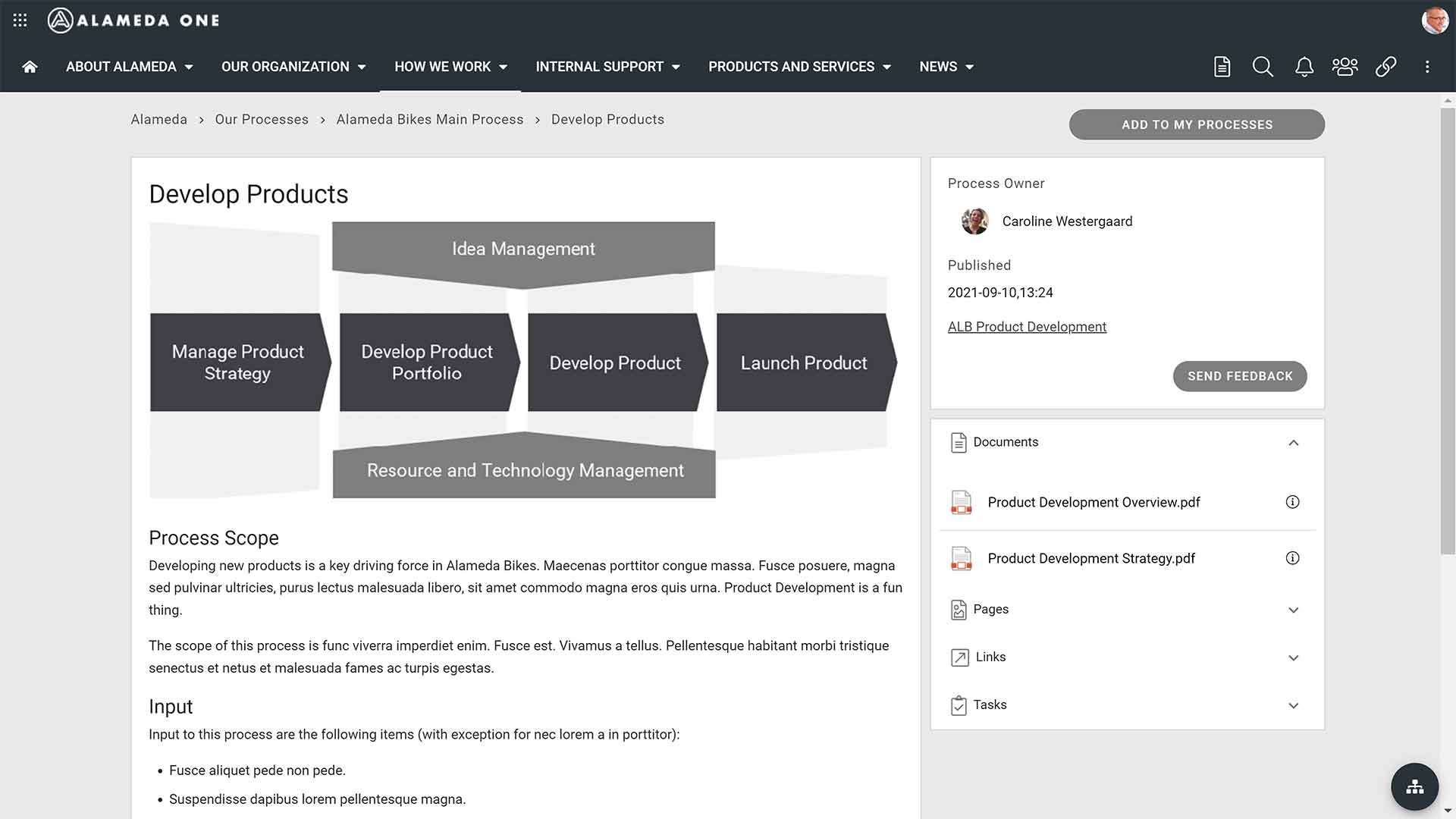
Image 9: Business processes and related information
Of course, this type of navigation is also applicable when you want to use organization charts as navigation to information about a department or unit. The charts are fully dynamic and can be easily updated when the organization changes.
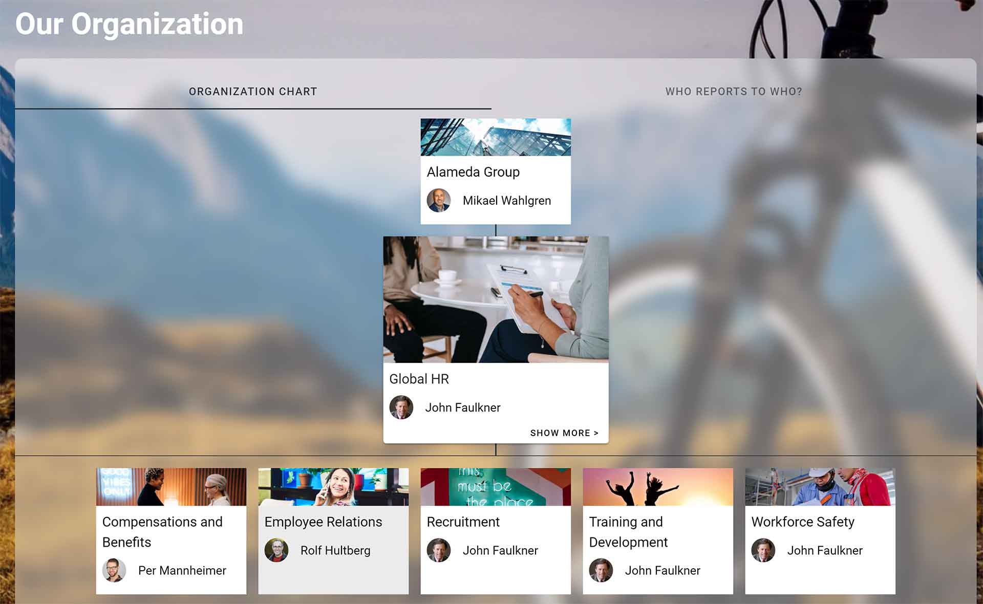
Image 10: Organization chart visual navigation
Personalized navigation
A modern intranet will also support several types of personalized navigation, where the preferences of end-users will decide the navigation. This can be done by asking employees to follow pages, documents, or teams, subscribing to areas of interest, and when information is targeted to the end-user based on properties. The below example shows personalized navigation to Followed Teamwork, a panel available across the solution and accessed from an icon in the top banner.
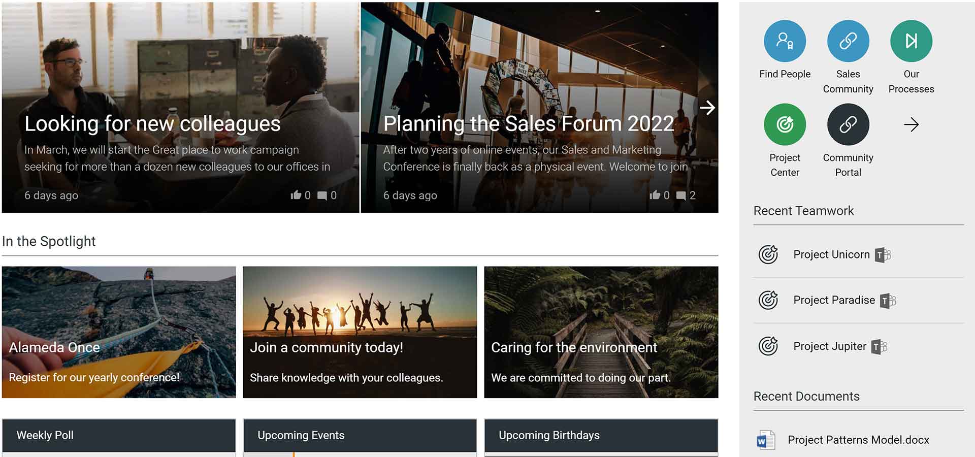
Image 11: Personalized teamwork navigation
In the last example in this article, the end-user will find personalized navigation to My Apps, Recent Teamwork, and Recent Documents in the right zone of the start page. We think having a zone on the start page dedicated to personalized navigation to frequently used content.
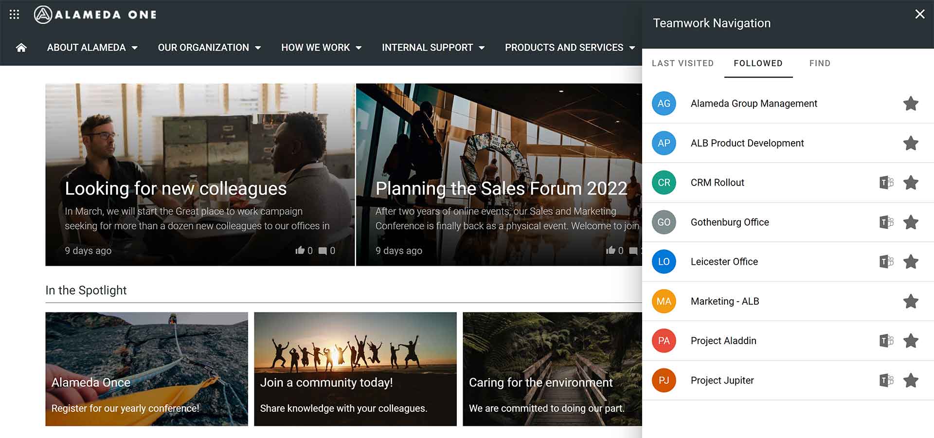
Image 12: Personalized navigation on the start page
Having those navigation options on the start page will enhance the feeling of quick navigation, being able to access recent content in only one click.
Learn more on intranet navigation best practices
For anyone that wants to learn more on how to improve the user experience of intranets, we recommend downloading the report ‘Intranet and Employee Experience Platforms 2022’ to take part in reviews of the best products in the market.
Since 2015 UK based ClearBox Consulting has published yearly reports on intranet products with the purpose to help workplace leaders, intranet managers, and IT professionals to understand the market and match products to priority requirements. The 2022 edition of the report was released in January covering in-depth reviews of 20 products and once again Omnia comes out as a top-rated product.
To learn more on intranet navigation, we also recommend attending the webinar ‘A best practice for intranet search and navigation’ which will give further insights to improving findability and user experience on your intranet. In the webinar, we will use Omnia and Microsoft 365 for all solution examples, but the content is highly relevant also if you are using other intranet products and platforms.
Please get in touch if you wish to get a demo of how Omnia can help to improve the search and end-user experience of your intranet.